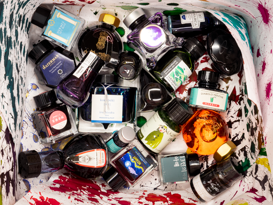


This week it's all about the blues, specifically Diamine Kensington Blue and Monteverde Horizon Blue. There are soooo many to choose from so I just picked two pretty well known inks that a lot of people seem to like to see how they compare.
Diamine Kensington Blue - This is a beautiful shade with maybe a gray ish undertone. It has a low saturation level and seems a tad dry. The shading is noticeable on both the Tomoe River paper as well as the Rhodia. No sheen noted. Dries fast.
Monteverde Kensington Blue - A luscious, beautiful shade of blue! 💙 I'm not detecting any undertones at all. Straight up blue. Very wet with nice shading, but just look at the red sheen on the Tomoe River paper! Gorgey gorge!
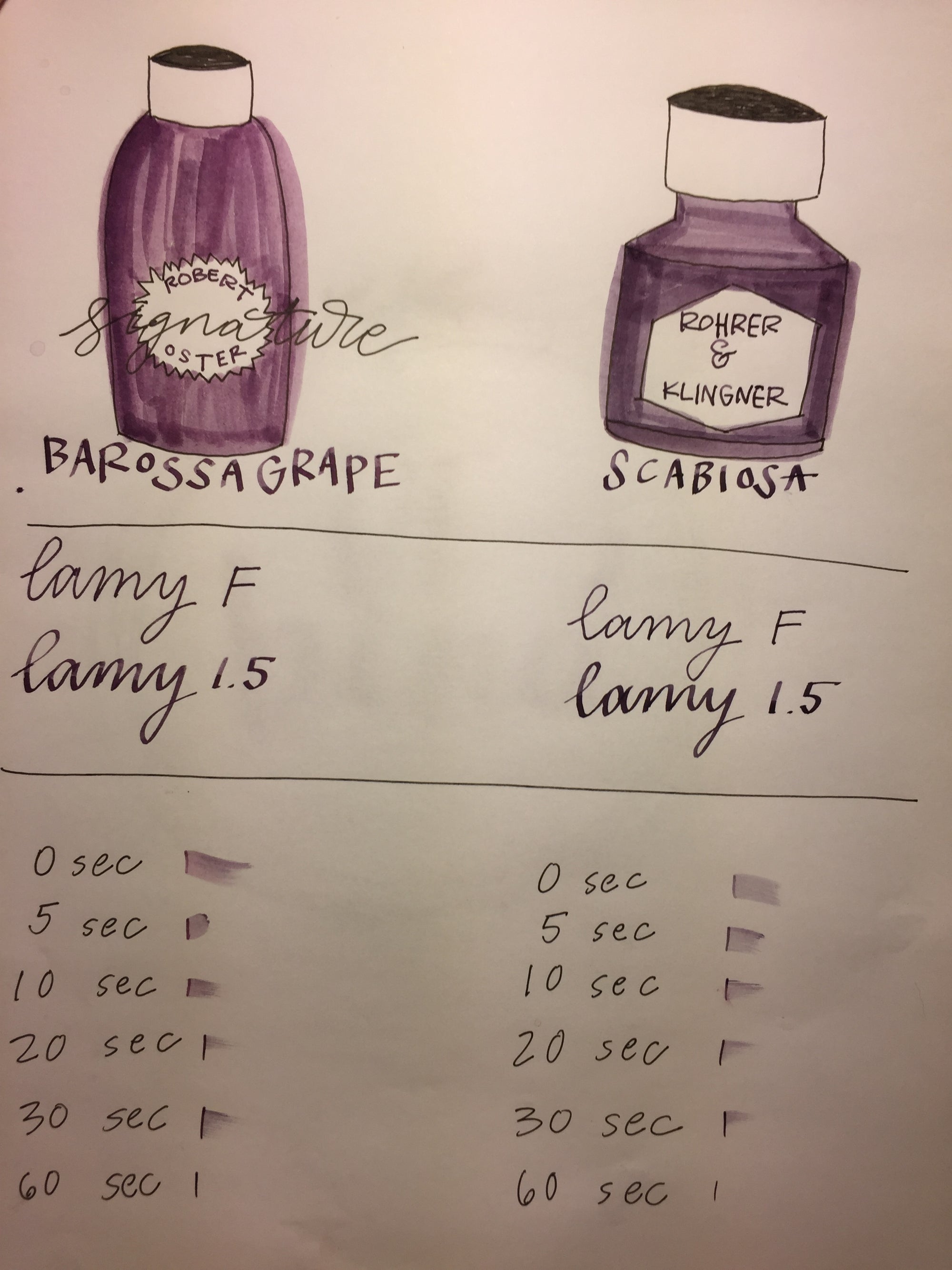
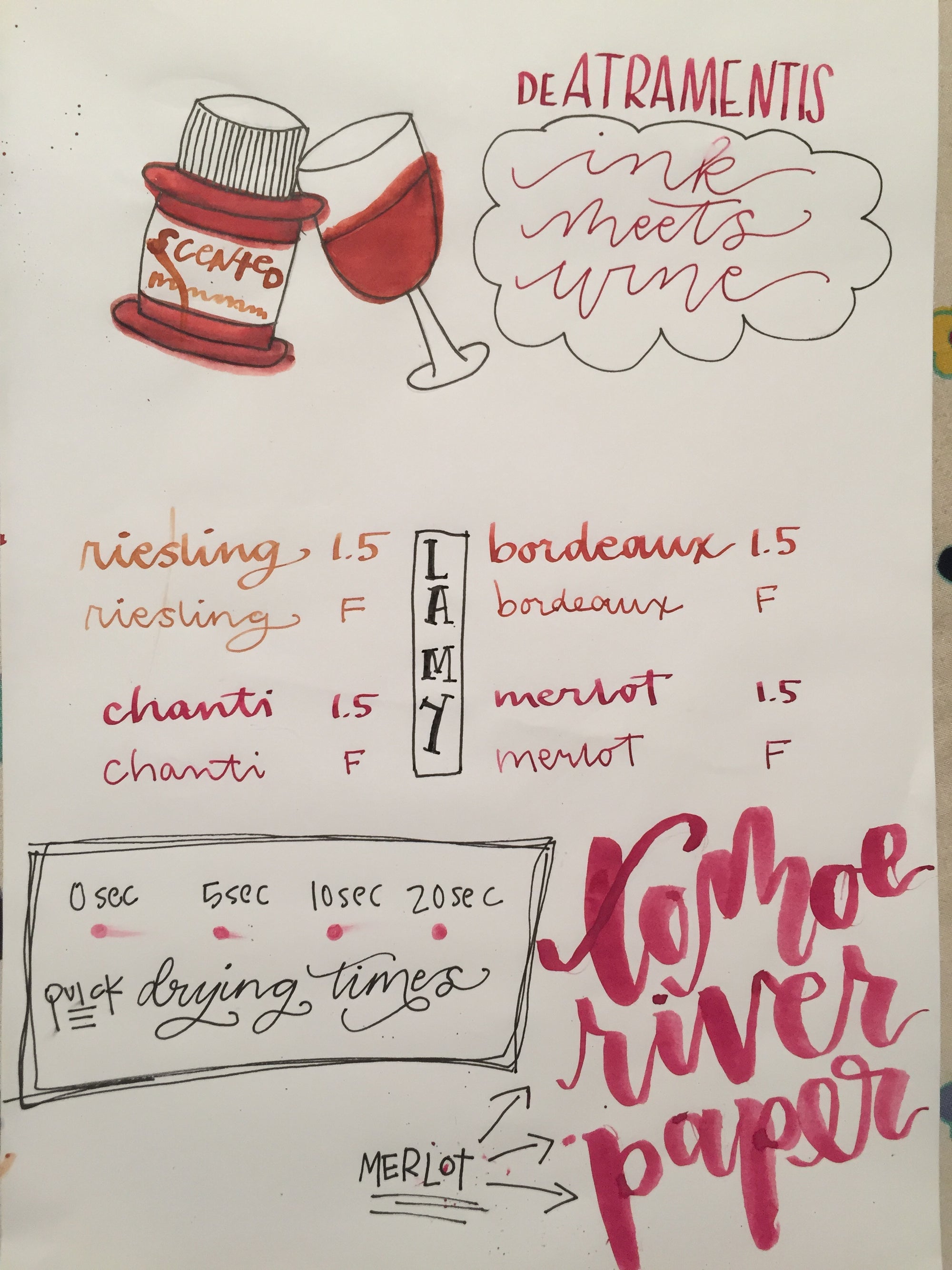
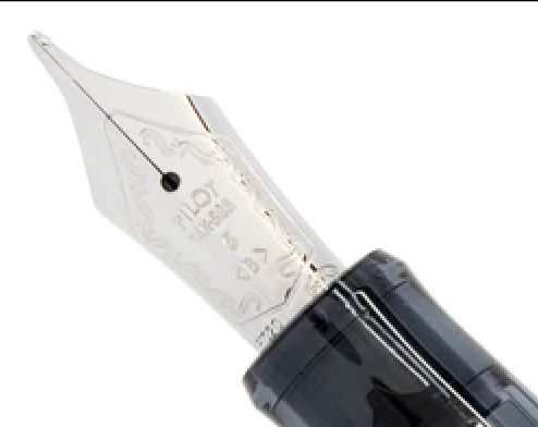
Below on Tomoe River paper, I used a Lamy 1.5 nib, Lamy F nib and a Pointed pen with Zebra G nib. The larger lettering was done with a #2 round brush. My fav!

Below same as above on Rhodia paper.

Modern calligraphy on Rhodia paper with #2 round brush

Splat! Nice shading!

I had to show an up close shot of this amazing red sheen!

What is your favorite blue ink?